

Miniature regulator series ARJ is part of SMC's pressure control equipment line. The ARJ series is available with or without one-touch fittings depending on the model type. All models come standard as direct operated relieving style. Two mounting thread options are available on the ARJ210 and ARJ310 series. ARJ1020F comes standard with M5 threads. Options include bracket, pressure gauge
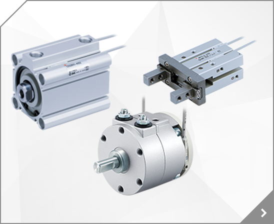
 Cylinder
 Tighten the screw to the recommended torque
Series CJP Construction/ Parts List Symbol =8tJ COJPB10 COJPB15 C8 JPB6 \ 8 0 8 0 CJP~6"'15 (Consl luction is same as CJPB6-1S.) In case of ~ 6 A In case 01 10,15 r I rn .' (ffi\ I I \ VJ / \.\WJ A A Parts List No. Description MBt~~ial Q., Flange busb Resin Trul'lnionlpin Stainless ... . Mate
Rc Special voltage With light Without DIN connector (With surge voltage suppressor) G 24 VAC 12 VDC 48 VAC NPT 1K 1L Rc 220 VAC 240 VAC Applicable to air and water (VXN<2) Conduit terminal 1M 1W (With surge voltage suppressor) 24 VAC 12 VDC 48 VAC 1N 1P 1Q 1R 1Y 1S 1T 2A 2B 2C 2D 2E 2F Enter symbols in the order below when ordering a combination of electrical option, other option. 220 VAC
center; padding: 14px 16px; text-decoration: none; transition: 0.3s; font-size: 12px; } /* Change background color of links on hover */ ul.tab li a:hover { background-color: #ddd; } /* Create an active/current tablink class */ ul.tab li a:focus, .active { background-color: #ccc; } /* Style the tab content */ .tabcontent { display: none; padding: 6px 12px; -webkit-animation: fadeEffect 1s
center; padding: 14px 16px; text-decoration: none; transition: 0.3s; font-size: 12px; } /* Change background color of links on hover */ ul.tab li a:hover { background-color: #ddd; } /* Create an active/current tablink class */ ul.tab li a:focus, .active { background-color: #ccc; } /* Style the tab content */ .tabcontent { display: none; padding: 6px 12px; -webkit-animation: fadeEffect 1s
center; padding: 14px 16px; text-decoration: none; transition: 0.3s; font-size: 12px; } /* Change background color of links on hover */ ul.tab li a:hover { background-color: #ddd; } /* Create an active/current tablink class */ ul.tab li a:focus, .active { background-color: #ccc; } /* Style the tab content */ .tabcontent { display: none; padding: 6px 12px; -webkit-animation: fadeEffect 1s
center; padding: 14px 16px; text-decoration: none; transition: 0.3s; font-size: 12px; } /* Change background color of links on hover */ ul.tab li a:hover { background-color: #ddd; } /* Create an active/current tablink class */ ul.tab li a:focus, .active { background-color: #ccc; } /* Style the tab content */ .tabcontent { display: none; padding: 6px 12px; -webkit-animation: fadeEffect 1s
center; padding: 14px 16px; text-decoration: none; transition: 0.3s; font-size: 12px; } /* Change background color of links on hover */ ul.tab li a:hover { background-color: #ddd; } /* Create an active/current tablink class */ ul.tab li a:focus, .active { background-color: #ccc; } /* Style the tab content */ .tabcontent { display: none; padding: 6px 12px; -webkit-animation: fadeEffect 1s
center; padding: 14px 16px; text-decoration: none; transition: 0.3s; font-size: 12px; } /* Change background color of links on hover */ ul.tab li a:hover { background-color: #ddd; } /* Create an active/current tablink class */ ul.tab li a:focus, .active { background-color: #ccc; } /* Style the tab content */ .tabcontent { display: none; padding: 6px 12px; -webkit-animation: fadeEffect 1s
center; padding: 14px 16px; text-decoration: none; transition: 0.3s; font-size: 12px; } /* Change background color of links on hover */ ul.tab li a:hover { background-color: #ddd; } /* Create an active/current tablink class */ ul.tab li a:focus, .active { background-color: #ccc; } /* Style the tab content */ .tabcontent { display: none; padding: 6px 12px; -webkit-animation: fadeEffect 1s
center; padding: 14px 16px; text-decoration: none; transition: 0.3s; font-size: 12px; } /* Change background color of links on hover */ ul.tab li a:hover { background-color: #ddd; } /* Create an active/current tablink class */ ul.tab li a:focus, .active { background-color: #ccc; } /* Style the tab content */ .tabcontent { display: none; padding: 6px 12px; -webkit-animation: fadeEffect 1s
center; padding: 14px 16px; text-decoration: none; transition: 0.3s; font-size: 12px; } /* Change background color of links on hover */ ul.tab li a:hover { background-color: #ddd; } /* Create an active/current tablink class */ ul.tab li a:focus, .active { background-color: #ccc; } /* Style the tab content */ .tabcontent { display: none; padding: 6px 12px; -webkit-animation: fadeEffect 1s
center; padding: 14px 16px; text-decoration: none; transition: 0.3s; font-size: 12px; } /* Change background color of links on hover */ ul.tab li a:hover { background-color: #ddd; } /* Create an active/current tablink class */ ul.tab li a:focus, .active { background-color: #ccc; } /* Style the tab content */ .tabcontent { display: none; padding: 6px 12px; -webkit-animation: fadeEffect 1s
center; padding: 14px 16px; text-decoration: none; transition: 0.3s; font-size: 12px; } /* Change background color of links on hover */ ul.tab li a:hover { background-color: #ddd; } /* Create an active/current tablink class */ ul.tab li a:focus, .active { background-color: #ccc; } /* Style the tab content */ .tabcontent { display: none; padding: 6px 12px; -webkit-animation: fadeEffect 1s
center; padding: 14px 16px; text-decoration: none; transition: 0.3s; font-size: 12px; } /* Change background color of links on hover */ ul.tab li a:hover { background-color: #ddd; } /* Create an active/current tablink class */ ul.tab li a:focus, .active { background-color: #ccc; } /* Style the tab content */ .tabcontent { display: none; padding: 6px 12px; -webkit-animation: fadeEffect 1s
center; padding: 14px 16px; text-decoration: none; transition: 0.3s; font-size: 12px; } /* Change background color of links on hover */ ul.tab li a:hover { background-color: #ddd; } /* Create an active/current tablink class */ ul.tab li a:focus, .active { background-color: #ccc; } /* Style the tab content */ .tabcontent { display: none; padding: 6px 12px; -webkit-animation: fadeEffect 1s
center; padding: 14px 16px; text-decoration: none; transition: 0.3s; font-size: 12px; } /* Change background color of links on hover */ ul.tab li a:hover { background-color: #ddd; } /* Create an active/current tablink class */ ul.tab li a:focus, .active { background-color: #ccc; } /* Style the tab content */ .tabcontent { display: none; padding: 6px 12px; -webkit-animation: fadeEffect 1s
center; padding: 14px 16px; text-decoration: none; transition: 0.3s; font-size: 12px; } /* Change background color of links on hover */ ul.tab li a:hover { background-color: #ddd; } /* Create an active/current tablink class */ ul.tab li a:focus, .active { background-color: #ccc; } /* Style the tab content */ .tabcontent { display: none; padding: 6px 12px; -webkit-animation: fadeEffect 1s
center; padding: 14px 16px; text-decoration: none; transition: 0.3s; font-size: 12px; } /* Change background color of links on hover */ ul.tab li a:hover { background-color: #ddd; } /* Create an active/current tablink class */ ul.tab li a:focus, .active { background-color: #ccc; } /* Style the tab content */ .tabcontent { display: none; padding: 6px 12px; -webkit-animation: fadeEffect 1s
center; padding: 14px 16px; text-decoration: none; transition: 0.3s; font-size: 12px; } /* Change background color of links on hover */ ul.tab li a:hover { background-color: #ddd; } /* Create an active/current tablink class */ ul.tab li a:focus, .active { background-color: #ccc; } /* Style the tab content */ .tabcontent { display: none; padding: 6px 12px; -webkit-animation: fadeEffect 1s